
A product can be exceptional and still look ordinary in a photograph. The difference is often not the camera or the editing. It is the decisions made before the shutter is pressed. Knowing how to stage product shoots means shaping a scene around the product’s value, the buyer’s expectations, and the brand story the image needs to carry.
For commercial teams, staging is where strategy becomes visible. It determines whether a product feels premium, approachable, technical, indulgent, sustainable, or built for hard work. Every surface, prop, shadow, and crop should give the audience a reason to look closer.
Start With the Job the Image Must Do
Before selecting a background or pulling props, define where the images will appear and what they must accomplish. A hero image for a website banner has different needs than a marketplace listing, social campaign, trade publication, or retail sell sheet. A broad horizontal composition may be ideal for an ad layout, while an ecommerce image may require a cleaner, more descriptive view.
Ask what a potential customer needs to understand in the first few seconds. Is it scale? Material quality? Ease of use? Flavor? Craftsmanship? If the product is new to the market, the shoot may need to explain it. If it is already well known, the assignment may be to reinforce a more aspirational feeling.
This is also the moment to identify non-negotiables: packaging details that must remain readable, colors that must be accurate, required negative space for copy, and the image formats needed by the marketing team. A strong shot list is not restrictive. It protects the essential deliverables, leaving room for creative discovery during the shoot.
Build the Set Around the Brand, Not the Props
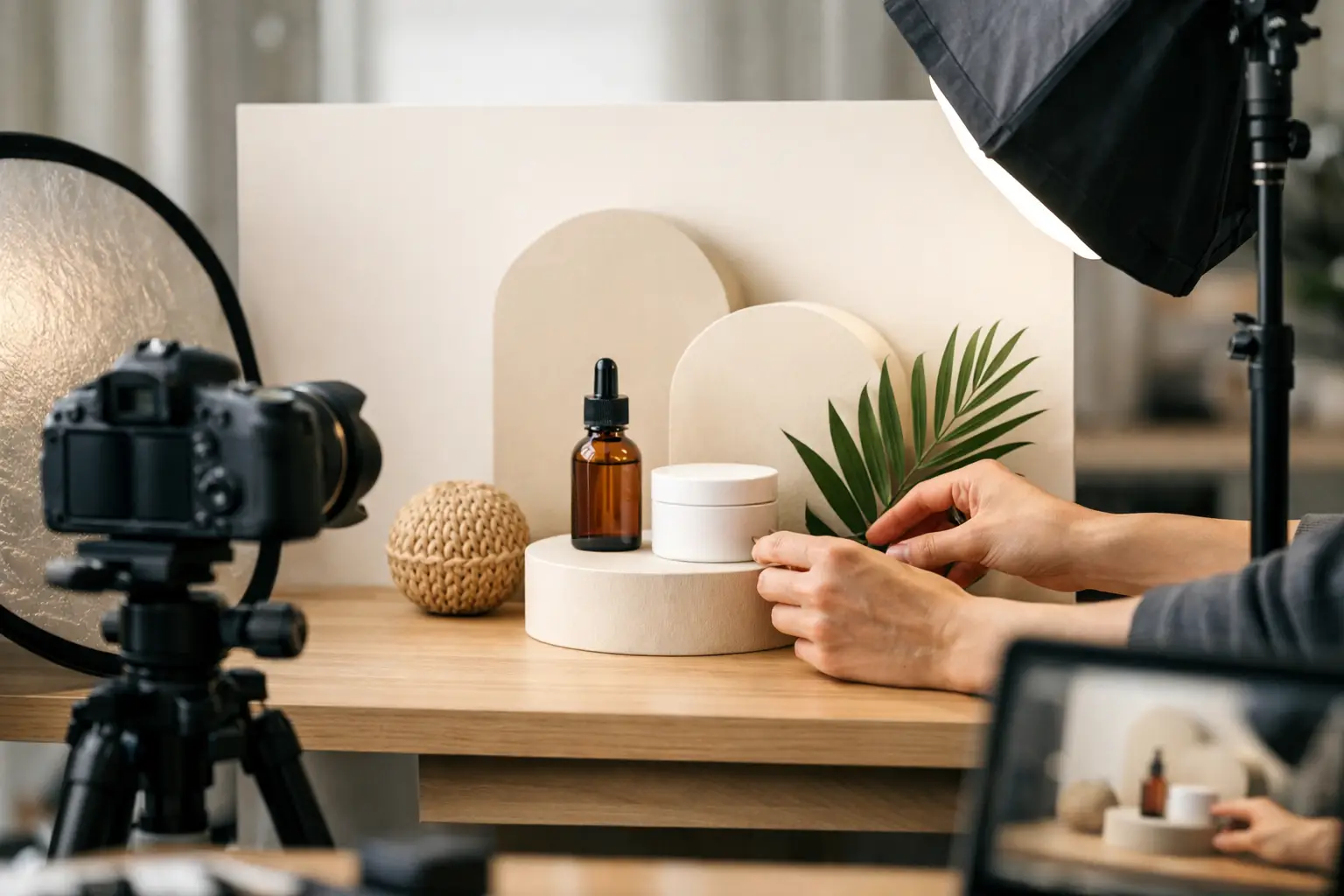
Props can add context and energy, but they should never become the subject. The most effective product sets begin with a concise visual direction: a palette, material references, texture, mood, and audience. A high-performance industrial component might sit against machined metal, clean concrete, or a working environment that signals precision. A handcrafted food product may call for natural linens, tactile ingredients, and warm directional light.
Choose materials that reinforce the product’s positioning. Stone can feel grounded and refined. Glass can feel clean and modern. Wood may suggest warmth, provenance, or craft. Paper, fabric, paint, and architectural surfaces can all be useful, provided they support the brand rather than competing with it.
Color requires the same discipline. A monochromatic set can make a bold package feel graphic and modern, while complementary colors can create more energy. It depends on the campaign. If brand color is already dominant in the product packaging, a neutral environment may give it room to lead. If the product itself is visually subtle, controlled color around it can help create impact.
Keep the set edited. When there are too many styling elements, viewers spend time decoding the scene instead of understanding the product. Remove anything that does not clarify function, elevate perceived value, or contribute to the intended emotion.
Use Props to Show a Real Moment
The best props answer a quiet question: how does this product belong in someone’s life? A bottle beside a glass, fresh garnish, and a casually folded napkin can establish an occasion. A skincare product with a towel, ceramic tray, and soft window-like light can suggest a considered routine. Tools or raw materials near a finished product can show the work and expertise behind it.
Avoid staging that feels overly literal or artificially busy. A desk product surrounded by generic office supplies says very little. A more specific detail, such as a thoughtfully selected notebook, a relevant material sample, or a real hand in action, can make the scene credible without explaining everything.
How to Stage Product Shoots With Light in Mind
Lighting should be planned alongside the set, not added after it is built. The direction, softness, and contrast of light change how every material reads. Glossy packaging may need carefully controlled reflections. Matte products often benefit from light that reveals texture without making the surface look flat. Glass, chrome, and highly reflective objects demand particular attention because every highlight can either define the form or become a distraction.
Start by deciding what mood serves the brand. Soft, broad light can feel calm, premium, and approachable. More directional light can create drama, dimension, and a stronger sense of atmosphere. Harder light may suit a fashion-forward campaign or product with sharp geometry, but it can also expose imperfections and make packaging difficult to read.
Build test frames before the final styling is locked. This is the fastest way to see whether a background is too reflective, a prop casts an awkward shadow, or a label needs a slight rotation. Small adjustments matter. Moving a product a few inches, raising it on a subtle platform, or changing the angle of a fill card can transform the visual hierarchy.
For consistent campaigns, document the lighting approach and set measurements. Repeatability matters when a product line expands, when seasonal assets need to feel related, or when different teams will use the visuals over time.
Create Depth Without Losing Clarity
A staged image needs layers, but it also needs an immediate focal point. Place the product where the eye will find it first, then use foreground and background elements to guide attention back toward it. Overlapping objects, soft texture in the foreground, and a background that falls gently out of focus can create dimension.
Be deliberate about scale. Small products can feel more substantial when photographed with a close perspective, considered elevation, and props that make sense proportionally. Oversized props can make a product appear insignificant, while a set that is too tight can feel cramped. For food, cosmetics, jewelry, and small consumer goods, this balance often determines whether the final image feels polished or improvised.
Composition should also leave practical room for marketing. A beautifully styled frame that offers no place for a headline may be difficult for an ad team to use. Capture variations: centered and symmetrical, off-center with negative space, close detail shots, and wider environmental frames. Each version gives the brand more ways to use the investment across campaigns.
Prepare Products Like They Are Going on Display
Products need more preparation than most teams expect. Dust, fingerprints, wrinkled labels, loose seals, scratched surfaces, and uneven fills are magnified in high-resolution photography. Bring multiple units whenever possible. One may have a better label, another may photograph more cleanly from the side, and a backup protects the schedule if a product is damaged during styling.
Create a small on-set care kit with microfiber cloths, cotton swabs, tape, scissors, gloves, adhesive putty, and any product-specific supplies. Food and drink shoots may require stand-in items for early lighting tests so the finished dish or beverage arrives only when the set is ready. Freshness is part of the image, and it cannot always be restored in post-production.
If hands or talent are involved, make their role purposeful. A hand opening a package, pouring a drink, applying a product, or adjusting equipment can bring scale and human connection. A hand placed in the frame without a clear action can feel staged in the wrong way.
Collaborate Before the Shoot Day
The strongest product photography comes from clear input early in the process. Marketing leaders, designers, product teams, and photographers should align on visual references, key messages, deliverable sizes, and approval priorities. That collaboration prevents a common problem: producing attractive images that do not fit the campaign’s actual needs.
A pre-production review should address what must be true in every final image and where the creative team has freedom. For example, a brand may require exact packaging color and a clear logo, while allowing the photographer to explore atmosphere, composition, and texture. Defining that line creates better work and faster decisions on set.
At Image Calgary, this is where photography becomes a brand-building process rather than a simple documentation exercise. Understanding the product, audience, and intended use gives the creative team a clearer foundation for images that feel both distinctive and commercially useful.
Leave Room for the Unexpected Frame
A production plan should be precise, but it should not eliminate experimentation. Once the essential shot list is complete, test a bolder crop, a new prop arrangement, a stronger shadow, or a more unexpected angle. Some of the most useful campaign images come from a variation discovered after the core setup is working.
The goal is not to fill a set with visual noise. It is to make one product feel worth noticing. When the staging reflects a clear brand point of view, the final photograph does more than show what is being sold. It gives customers a believable reason to want it.