
A beautiful plate can still miss the mark if it does not feel like your brand. The strongest menu, packaging, campaign, and social images are built with intention well before the camera comes out. This food photography styling guide is designed for brands that need more than an appetizing image – they need visual content that creates recognition, trust, and a clear reason to choose them.
Food styling is where culinary detail meets commercial strategy. It shapes what customers notice first, how they perceive quality, and whether a dish feels casual, premium, handcrafted, indulgent, or health-forward. A styling choice as simple as a wrinkled linen napkin or a glossy sauce finish can change the entire message.
Start With the Brand Story, Not the Plate
Before selecting props or arranging ingredients, define what the image needs to communicate. A neighborhood bakery may want warmth, abundance, and the tactile appeal of fresh-baked goods. A meal-prep company may need clean composition, ingredient clarity, and a sense of efficiency. A high-end restaurant may prioritize restraint, atmosphere, and chef-driven precision.
This step prevents a common problem: food photographs that look attractive but could belong to any business. Brand-forward styling gives every element a role. Color, surface, plating, garnish, glassware, and background should support the personality customers encounter in your space, on your packaging, or through your service.
For a commercial shoot, establish the intended use early. Website banners need negative space for copy. Delivery-app listings need immediate clarity at a small size. Editorial content can carry more mood and detail. Social campaigns may call for a vertical composition with a strong focal point in the first second of viewing. One dish can be styled differently depending on where the image will live.
Build a Visual Direction Before Production
A practical creative brief saves time on set and makes collaboration more productive. It does not need to be overly complicated. It should identify the audience, the campaign goal, the desired emotional response, the required deliverables, and a few visual reference points.
The goal is not to duplicate another brand’s imagery. Reference images help a team align on qualities such as bright and energetic, dark and intimate, rustic and approachable, or polished and minimal. They also surface important decisions before production day: Is the food photographed from overhead, at table height, or in an immersive lifestyle setting? Are hands present? Does the image feel spontaneous or carefully composed?
A good direction also acknowledges practical limitations. Some dishes hold their shape for a long time, while others have a narrow window when they look their best. Ice cream, melted cheese, delicate herbs, fried foods, and cold beverages require careful timing. The styling plan should support the food rather than ask it to behave in ways it cannot.
Use Color and Texture With Purpose
Color is often the fastest way to create appetite and establish a mood. Warm tones can suggest comfort, richness, and generosity. Fresh greens, bright citrus, and clean whites can communicate energy, freshness, and simplicity. Deep charcoals, jewel tones, and darker shadows often suit premium beverage, steakhouse, or evening dining photography.
The right palette depends on the brand and the product. A colorful taco spread may benefit from layered ingredients and lively ceramics. A refined plated dessert may be stronger against a quieter background, where the texture of the mousse or glaze has room to command attention. More color is not always more effective.
Texture creates dimension, especially in images viewed on screens. Think of the contrast between a crisp crust and soft crumb, a matte stone surface and a glossy cocktail, or a folded napkin beside a smooth ceramic plate. These details make food feel tangible. They also help a still image imply temperature, freshness, and craft.
Keep textures controlled. Too many patterned props, competing fabrics, or scattered ingredients can make a dish feel lost. When the food is the product, it must remain the visual priority.
Choose Props That Support the Food
Props should add context without turning the frame into a collection of unrelated objects. The best choices often reflect how a customer experiences the product: a branded coffee cup in a café setting, a serving spoon beside a family-style dish, or hands reaching for a shared appetizer.
Material matters. Wood can feel warm and familiar. Natural stone can feel premium and grounded. Bright tile may bring a fresh, contemporary energy. Vintage cutlery can add nostalgia, while clean glassware and simple ceramic forms can reinforce a modern, confident identity.
For most commercial food photography, restraint is more valuable than variety. Ask whether each prop clarifies the scene, supports the palette, or adds meaningful scale. If it does none of those things, remove it. Empty space is not wasted space when it lets a hero dish stand out and gives marketing teams room for messaging.
Style Food for the Camera, Not Only the Table
Restaurant service and photography have different requirements. A dish must be real, recognizable, and faithful to the customer experience, but it may need small adjustments to read well in a photograph. That can mean turning a protein toward the light, spacing toppings more deliberately, refreshing herbs, or building height in a sandwich so its layers are visible.
The camera flattens depth, which is why layering is valuable. Foreground ingredients, a clear hero element, and a softer background can create a natural sense of dimension. A slight movement in a sauce drizzle, a lifted fork, or a pour in progress can add energy without making the image feel staged.
Freshness cues matter. A light touch of oil can restore luster to roasted vegetables. Condensation can make a cold drink feel more inviting. Crumbs, flour, and a few intentional drips may communicate handmade preparation. The key word is intentional. Mess can suggest abundance and authenticity, but uncontrolled mess can suggest poor quality or distract from the product.
Lighting Determines the Appetite Appeal
Lighting is not simply a technical decision. It affects whether food appears fresh, rich, soft, crisp, or flat. Directional side light often reveals texture in bread, grilled proteins, pastries, and layered dishes. Backlight can make drinks glow and highlight steam, translucency, or the edge of a garnish. Soft frontal light can work well for clean, direct menu imagery.
Natural-looking light is popular because it feels approachable, but it still needs control. Harsh shadows may suit a bold, graphic campaign, while diffused light is often more flattering for food with reflective sauces or delicate surfaces. The right treatment depends on the visual direction, not a universal rule.
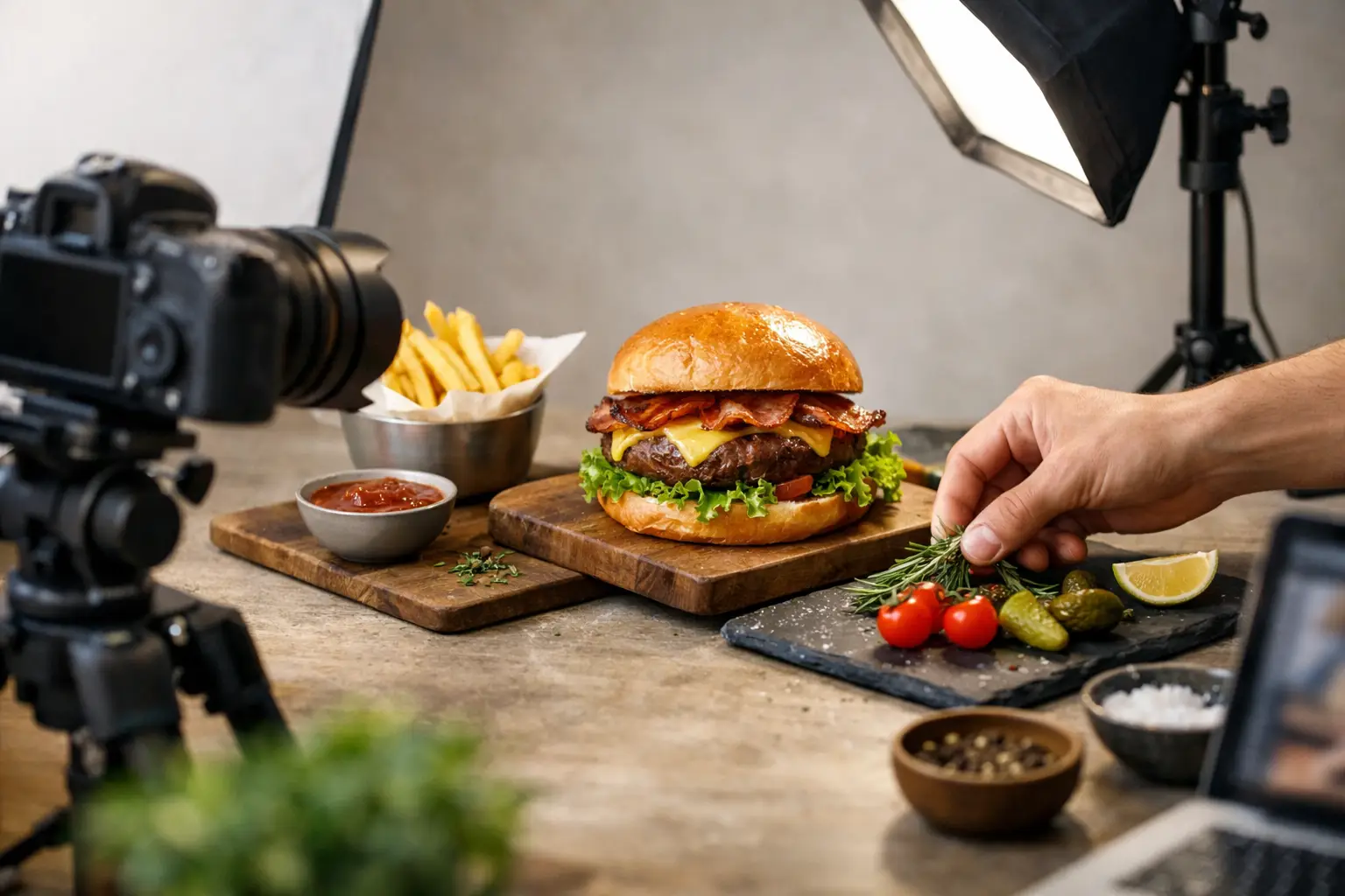
A professional food set is built to allow adjustment. Small changes in the position of a plate, reflector, flag, or light source can dramatically improve contrast and shape. This is where collaboration between photographer, stylist, chef, and marketing team produces better results than working in isolation.
Plan a Shot List That Protects Your Investment
A food shoot should create a useful image library, not just one hero frame. Once the set is styled and lit, capture the planned variations efficiently. A well-considered shot list may include:
- Hero images for websites, menus, ads, and campaign headers
- Vertical crops for social content and stories
- Detail images that highlight ingredients, texture, or preparation
- Lifestyle frames featuring hands, guests, staff, or service moments
- Wider environmental images that connect the food to the restaurant or brand setting
This approach gives a marketing team flexibility while maintaining visual consistency. It also helps identify which dishes, products, or seasonal features deserve priority before production begins.
Food Photography Styling Guide: Common Missteps
The most frequent styling issue is trying to show everything at once. Multiple dishes, vibrant props, dense backgrounds, and excessive garnish can compete for attention. A stronger image usually begins with one clear focal point and builds outward.
Another misstep is styling food into something customers will not receive. Commercial imagery should present the best version of the real product, not create unrealistic expectations. That balance protects credibility and makes photography work harder for the business over time.
Finally, avoid treating food imagery as a one-time task. Seasonal menus change, packaging evolves, and brands grow. A consistent photography strategy allows new content to feel connected to what came before while still giving customers a reason to pay attention.
At Image Calgary, collaboration is the key to creativity. When the styling, lighting, and composition are built around your brand story, food photography becomes more than a record of what is on the table. It becomes an invitation customers can almost taste.