
A plated dish has only a few seconds to communicate appetite, quality, and point of view. On a restaurant website, a menu, or a campaign image, customers are not simply looking at food. They are deciding what kind of experience your brand promises. Knowing how to style plated food means making deliberate choices about shape, color, texture, and light so the final image feels as considered as the dish itself.
For restaurant and hospitality brands, food styling is not decoration added at the end. It is part of visual storytelling. A casual neighborhood bistro may benefit from generous, relaxed plating that feels welcoming and abundant. A fine-dining concept may need restraint, precision, and negative space. The goal is not to make every plate look identical. It is to make every image feel unmistakably aligned with the brand.
Start With the Brand Story, Not the Garnish
Before the plate reaches the set, establish what the image needs to say. Is the restaurant ingredient-led and seasonal? Fast, vibrant, and social? Refined and intimate? Those decisions influence everything from plate selection to camera angle.
A dark ceramic bowl can make a rich pasta dish feel grounded and dramatic, while a clean white plate may better suit a bright lunch menu or a health-forward concept. Neither choice is universally better. The right choice gives the food enough contrast while reinforcing the atmosphere customers should expect.
This early planning also keeps a photo shoot efficient. When the creative team, chef, and marketing lead agree on the visual direction, styling decisions have a clear purpose. Collaboration is the key to creativity, especially when the final images must work across a website banner, printed menu, social campaign, and delivery platform.
How to Style Plated Food With Strong Composition
Good food composition gives the eye a place to begin and a reason to keep looking. A plate should feel intentional without appearing overworked. Start by identifying the hero: it may be the browned edge of a steak, the glossy sauce on dumplings, the layers in a cake, or the color of peak-season produce. Build the plate so that hero remains visible from the intended camera angle.
Avoid centering every element by default. Centered plating can work well for symmetrical dishes, particularly when photographed straight on, but an offset arrangement often creates more movement and feels less static. Think in triangles, curves, and small groupings rather than a row of disconnected components.
Negative space is equally useful. A packed plate can communicate generosity, but it can also become visually confusing in a photograph. Leaving room around the food helps the eye read the ingredients and gives designers flexibility when an image needs copy or a logo placed beside it. The trade-off is simple: too much empty plate can make a portion look slight, while too little can hide the craftsmanship. Test the arrangement through the camera, not only from the chef’s perspective at the pass.
Choose the Camera Angle Before Final Plating
The angle changes what needs to be visible. Overhead photography suits flat dishes, spreads, pizzas, bowls, and shared-table scenes because it shows arrangement and color clearly. A three-quarter angle is often more versatile for entrées, burgers, stacked items, and dishes with height. It captures dimension while still revealing the plate.
For tall desserts, sandwiches, layered drinks, or a dish with a strong vertical build, a lower camera position can be effective. However, this angle demands more attention to the front edge of the plate. If the most attractive garnish is hidden behind the main component, reposition it before shooting.
Build Contrast Through Color and Texture
The most appetizing food images usually contain contrast. That does not mean every plate needs bright colors or dramatic styling. It means the elements should separate clearly enough to be understood quickly.
Use color with intention. A green herb or crisp vegetable can bring life to a warm-toned dish, while a berry sauce can create focus against a neutral dessert. But garnishes should earn their place. Adding microgreens to every dish can make a menu feel generic, and a garnish that does not belong in the recipe may create an expectation the guest will not receive.
Texture is what makes a still image feel tactile. Look for a crisp edge, a brushed sauce, a dusting of spice, a shine of olive oil, or the uneven crumb of fresh bread. Combining matte and glossy surfaces can make a dish more dimensional. For example, a creamy puree reads beautifully beside roasted vegetables with caramelized edges, especially when the lighting catches both surfaces differently.
Freshness is non-negotiable. Replace wilted herbs, cracked toppings, streaked plates, and melting components immediately. Food styling for photography often requires multiple versions of the same dish because heat, steam, ice, and sauces change quickly under lights. That is not a failure of the kitchen. It is part of producing polished commercial imagery.
Use Sauce, Garnish, and Height With Restraint
Sauce is one of the most powerful styling tools on the plate. It can guide the eye, add sheen, and connect separate elements. A spooned pool may feel classic and elegant; a controlled brushstroke may feel more contemporary. What matters is consistency with the restaurant’s presentation style.
Keep the plate rim clean unless the concept calls for a more casual, expressive look. Accidental splashes tend to read as messy rather than artful in high-resolution photography. Work slowly with small tools, then check the plate from the camera position. Details that look minor in person can become distracting when enlarged on a website or in print.
Height can add energy, but unstable stacks can look forced. Build height where it reflects the food naturally: a mound of greens, folded pasta, a layered dessert, or a sandwich designed to show its interior. If a component has to be balanced unnaturally to create drama, it will rarely look convincing for long.
Style the Scene Around the Plate
The food is the priority, but the environment gives it context. Table surfaces, linens, cutlery, glassware, and background ingredients can all support the story. A handcrafted ceramic plate on textured wood may suit a chef-driven concept. Crisp linens and refined stemware may be more appropriate for a premium dining room. For a quick-service brand, clean surfaces and bold, simple props often keep the message clear.
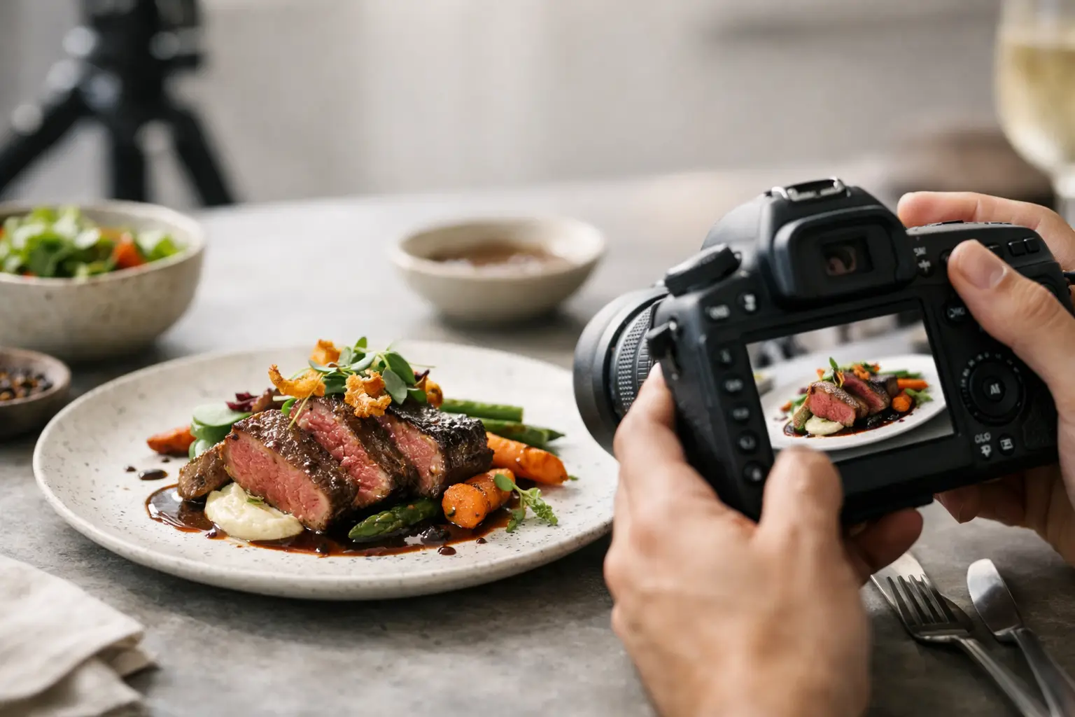
Use supporting elements sparingly. A second dish at the edge of frame, a hand reaching for a fork, or a poured drink can create a sense of occasion. Too many props compete with the hero plate and make an image harder to use in marketing layouts. The best food photography feels lived-in when needed, but never cluttered.
Consider where the image will appear. A vertical social placement may benefit from height, hands, and environmental detail. A wide homepage image needs room for text. A delivery menu image generally needs a clean, accurate view of the dish. One styled plate can be photographed several ways, but each frame should serve a defined commercial purpose.
Let Lighting Make the Food Believable
Lighting determines whether texture looks delicious or flat. Directional side light often works well because it reveals shape, steam, crispness, and surface detail. Softer light can feel inviting and natural, while harder light may suit a more graphic, high-energy campaign. The decision should reflect the brand as much as the dish.
Be careful with highly reflective sauces, glassware, and white plates. Too much direct light can create distracting hotspots. Too little direction can make a fresh dish look dull. A professional food photography setup balances highlights and shadows so the food retains depth without losing important detail.
Color accuracy also matters. Guests should recognize what they order. Overly warm editing can make greens look tired; excessive saturation can make sauces and proteins feel artificial. Visual polish should elevate the food, not misrepresent it.
Create a Repeatable Styling Process
Restaurants often need more than one beautiful image. They need a visual system that can grow with seasonal menus, campaigns, and new locations. Document preferred plateware, backgrounds, lighting direction, camera angles, and editing style after a successful shoot. This creates consistency without making future imagery repetitive.
A simple pre-shoot plan can identify hero dishes, backup dishes, dietary considerations, prop needs, and the order in which items should be prepared. Photograph the most time-sensitive dishes first, then move to plates that hold well. This protects food quality and gives the kitchen a clearer workflow.
The strongest plated food images are built through partnership. When culinary craft, brand strategy, and photographic direction work together, the result is more than an attractive plate. It is an image that makes customers pause, imagine the first bite, and recognize the value of the experience waiting for them.