
A beautifully designed lobby can still look flat, cramped, or impersonal in a photograph. The difference is rarely the space alone. Knowing how to photograph architectural interiors means translating design intent, natural light, and brand character into an image that gives viewers a reason to step closer.
For businesses, interior photography is more than documentation. It shows clients what it feels like to visit, work, eat, stay, or meet in a space. Whether you are photographing a corporate office, restaurant, hotel, clinic, showroom, or public-facing facility, every choice should support the experience your brand wants people to associate with it.
Start With the Story the Space Needs to Tell
Before a camera comes out, establish the job of the photographs. An architect may need images that emphasize material details, structure, and design decisions. A hospitality operator may need warmth, energy, and a clear sense of guest comfort. A professional services firm may want a workplace that feels capable, welcoming, and modern without appearing staged.
This is where collaboration is the key to creativity. Ask what the audience should notice first, how the images will be used, and which parts of the space are commercially significant. A wide image for a website banner has different priorities than a vertical image for a social campaign or a detail image for an editorial feature.
Walk the location with the client or site contact whenever possible. Notice the first visual impression, the strongest architectural lines, signature finishes, views through windows, and areas that may create problems. A room can be visually impressive in person but difficult to photograph because of mixed lighting, clutter, reflective glass, or limited camera position. Identifying those issues early protects both the schedule and the final work.
How to Photograph Architectural Interiors With a Shot Plan
A thoughtful shot plan keeps the session focused while leaving room for discovery. Begin with the essential hero images: exterior-to-interior transitions, main public spaces, key rooms, and the features that distinguish the property from competitors. Then plan supporting images that show texture, craftsmanship, circulation, and useful details.
For a commercial project, variety matters. Marketing teams need more than one polished wide shot. They often need horizontal and vertical compositions, negative space for copy, close details for social content, and images that work across web, print, presentations, and media coverage.
Timing is equally strategic. Morning sun may light one side of a building beautifully while making another room impossible to balance. Restaurants may be easier to photograph before service, but some spaces need a small amount of activity to feel alive. Offices may require a quiet window for clean architectural frames, followed by a second phase with employees using the space naturally.
A useful plan accounts for those changing conditions rather than forcing every room into the same visual formula.
Choose the right equipment for control
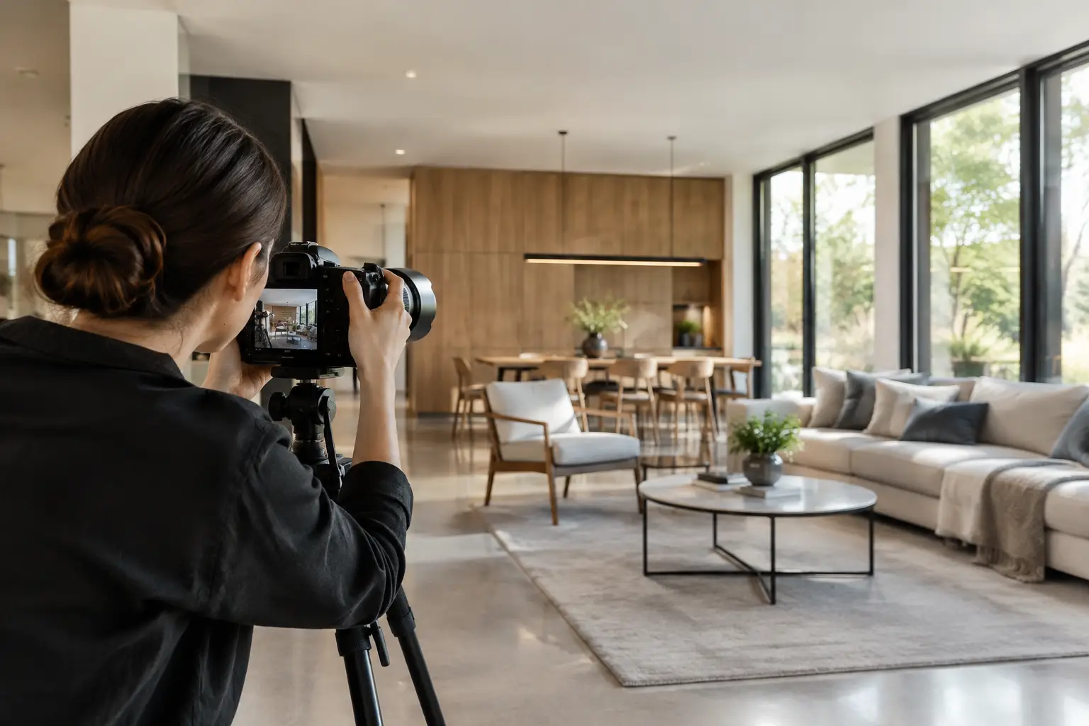
A full-frame camera, sturdy tripod, wide-angle lens, and remote release create a reliable starting point. The tripod is not optional when quality matters. It lets you slow down, refine composition, maintain a consistent camera height, and blend multiple exposures without alignment issues.
Wide lenses are necessary in tight rooms, but going too wide can distort a space and make it feel less believable. A focal length in the moderate wide-angle range often produces a more natural result than an extreme perspective. The goal is not to make every room look larger than it is. It is to make it look inviting, functional, and accurately considered.
Tilt-shift lenses can be valuable for high-end architectural work because they help keep vertical lines straight in-camera. They are not required for every assignment, but they reduce correction work and preserve more of the image. When using a conventional lens, keep the camera level and avoid tilting it upward or downward unless the composition calls for it deliberately.
Control Light Before You Compose Around It
Interior light is almost always mixed. Daylight from windows may be cool, overhead fixtures may be warm, and decorative lighting may introduce additional color shifts. If these sources are left unmanaged, white walls can turn gray, yellow, or blue, and the visual atmosphere can feel accidental.
Start by deciding what should motivate the image. In many commercial interiors, window light creates depth and a sense of openness, while practical lights add warmth and show that the space is active. In others, especially windowless rooms or evening hospitality spaces, the fixtures themselves become the visual anchor.
Turn off lights that create distracting color casts or harsh pools of brightness. Keep lights on when they add shape, draw attention to an important area, or contribute to the intended mood. It depends on the space and the brand. A bright, clean healthcare setting may call for even, neutral light, while a restaurant may need a more layered, intimate treatment.
Flash and supplemental lighting can help lift dark corners, control contrast, and reveal texture in finishes. The best use of added light is often subtle. It should support the natural logic of the room rather than announce itself. If a polished table, glass partition, or artwork reflects a light source, move the light or adjust the camera angle before assuming it can be fixed later.
Build Compositions That Feel Intentional
Strong interior images give the viewer a clear path through the frame. Look for leading lines in flooring, ceiling details, furniture placement, doorways, and windows. Use them to direct attention toward the room’s defining feature, whether that is a reception desk, a fireplace, a sculptural staircase, or a carefully designed bar.
Keep verticals vertical. Leaning walls are one of the quickest ways to make a professional space look careless. Set the camera at a height that suits the room, often around chest height, then check the frame edges carefully. Small adjustments in height or position can improve the relationship between furniture, windows, and architectural lines.
Corners are useful because they reveal depth, but they are not always the best answer. A straight-on composition can be more powerful when symmetry is central to the design. Conversely, a slightly offset viewpoint may bring more life to a room that feels too formal. Photograph several options before deciding which frame carries the strongest message.
Foreground elements can add scale and dimension, but they should not become visual clutter. A chair back, plant, countertop edge, or doorway can guide the eye into the scene. If it blocks the design or competes with the focal point, remove it from the frame.
Style for the camera, not just the room
A room that is operationally ready is not always camera-ready. Remove visible cords, cleaning supplies, temporary signs, half-empty beverage stations, wrinkled cushions, and items that date the image. Straighten chairs, align window coverings, fluff textiles, and check every surface for fingerprints and dust.
Styling should feel credible. A restaurant table can benefit from place settings and a few intentional details, but it should not look like a display window if the brand is known for relaxed service. An office should show signs of real work without becoming visually chaotic. The best styling reinforces the personality of the business already present in the space.
People can be equally valuable. A carefully placed employee or guest gives scale, shows purpose, and creates emotional connection. Their presence needs direction, though. Ask them to perform a simple, natural action, such as greeting a client, reviewing a sample, or sharing a meal. Avoid having people stare at the camera unless the image is intended as a portrait.
Protect Detail With Thoughtful Exposure and Editing
Windows and dark interiors create a broad brightness range that a single exposure may not capture cleanly. Bracketing exposures allows you to preserve detail outside while maintaining a natural-looking interior. The finished image should not look heavily processed or unrealistically bright. It should simply feel balanced.
Capture a base exposure for the room, then additional frames for bright windows, deep shadows, and important light fixtures. For reflective surfaces, take a moment to create alternate frames with different lighting or positioning. These options make retouching more efficient and prevent a small issue from limiting an otherwise strong image.
Post-production is where consistency comes together. Correct lens distortion and perspective, balance color temperature, remove distractions, and refine contrast without losing the material character of wood, stone, fabric, metal, and glass. Keep edits aligned across the full gallery so a brand’s website or campaign looks cohesive rather than assembled from unrelated scenes.
There is a trade-off between polish and authenticity. Removing every imperfection can make a space feel generic. Leaving every operational detail can weaken the visual message. Good retouching preserves the truth of the environment while presenting it at its best.
Create Images That Keep Working After the Shoot
The strongest architectural interiors photography earns its place across multiple channels. It gives a marketing team hero imagery for a website, editorial-ready frames for media outreach, detail shots for social posts, and flexible compositions for presentations and printed collateral.
That requires planning beyond the single final image. Leave copy space where appropriate. Photograph key rooms in both orientations. Capture clean architectural views, then create versions with people and brand activity. A space is not only an asset to document. It is evidence of how a company thinks, serves, and creates value.
At Image Calgary, that connection between environment and brand story guides the work. When an interior is photographed with technical precision and a clear commercial purpose, it does more than show a room. It gives people a reason to imagine themselves inside it.