
A commercial portrait is not simply a well-lit headshot. It is a decision about how your company wants to be seen before a prospect reads a word of copy or starts a conversation. This commercial portrait session guide helps marketing leaders, business owners, and communications teams plan imagery that looks polished, feels credible, and belongs naturally within their brand.
The strongest portraits do more than show who works at your organization. They communicate authority, approachability, precision, energy, or care – the qualities clients, customers, and future employees should associate with your business. That requires more than asking people to stand against a clean background. It requires a clear creative direction, thoughtful production planning, and a photographer who understands the commercial role each final image needs to play.
Start With the Business Purpose
Before selecting a location, wardrobe palette, or lighting style, define where the images will live and what they must accomplish. A portrait created for an executive bio page has different requirements than one created for a recruitment campaign, an annual report, a LinkedIn presence, or a national advertising placement.
Ask what the viewer should understand in the first few seconds. A professional services firm may need to project confidence and clarity. A hospitality brand may want warmth and personal connection. An industrial company may need portraits that show real expertise within an active working environment. None of these directions is better than another, but each calls for different choices in composition, setting, expression, and visual energy.
This early alignment also protects the investment. When a team books portraits without a defined use case, the result can be attractive but limited. When the images are planned around specific channels and messages, they can support web design, proposals, editorial profiles, social campaigns, internal communications, and media requests for much longer.
Build a Practical Shot Plan
A shot plan turns broad objectives into an efficient production day. It should identify who will be photographed, how many final looks each person needs, the preferred orientation for each image, and the intended crop requirements.
For example, a website redesign may require horizontal portraits with generous negative space for text, while a speaker announcement may need vertical images with room for platform-specific cropping. If your team needs both formal and relaxed options, plan for them rather than hoping to create every variation from one setup.
Consider the full asset mix. Individual leadership portraits may be essential, but a company may also benefit from small-group images, environmental portraits, candid working moments, and detail-driven images that show tools, materials, or the workplace itself. Together, these create a more complete visual story than matching headshots alone.
Choose a Visual Direction That Feels Like Your Brand
Commercial portrait photography should be consistent with the rest of your visual identity. Review your current website, campaign materials, brand guidelines, and image library before the session. Look for patterns in color, contrast, composition, and tone. Then decide whether the new work should reinforce that approach or deliberately move the brand forward.
A studio background can create a focused, timeless result. It works especially well when consistency across a large team is the priority, or when portraits need to integrate cleanly into a website or presentation template. Environmental portraits, on the other hand, add context. Photographing an architect in a light-filled project space, a chef in a working kitchen, or an operations leader on the production floor can make expertise more immediate and believable.
The trade-off is control. Studio sessions offer predictable lighting and faster consistency. Location portraits can feel more distinctive and narrative-driven, but they require more attention to backgrounds, site conditions, safety, weather, and visual distractions. The right approach depends on your brand story and the visual needs of the project.
Lighting Sets the Emotional Tone
Lighting is one of the quietest and most influential choices in a portrait session. Soft, open light can feel approachable and modern. More directional light can bring depth, shape, and a stronger editorial edge. Neither style should be selected because it is fashionable. It should support the person, the environment, and the message.
A creative team should also consider how lighting will translate across the final channels. A dramatic portrait may look exceptional in a full-page print feature but lose detail when reduced to a small website thumbnail. Conversely, a very flat portrait can feel clean online but may not have enough presence for a campaign image. Reviewing intended use early helps make those decisions with purpose.
Prepare People Without Making Them Feel Overproduced
Many employees are not comfortable in front of a camera, and that is normal. The goal is not to make every person pose like a professional model. It is to create an environment where people can look confident, natural, and like themselves at their best.
Share clear guidance in advance. Let participants know the session timing, location, wardrobe expectations, and whether hair and makeup support will be available. Vague instructions such as “dress professionally” tend to create an inconsistent result. More useful direction explains the desired level of formality, recommends solid colors or subtle patterns, and notes any colors that may conflict with the setting or brand palette.
Wardrobe should support the portrait rather than compete with it. Clothing that fits well, photographs cleanly, and reflects the person’s professional role usually works best. Highly reflective fabrics, tiny patterns, visible logos from unrelated brands, and overly casual pieces can pull attention away from the subject.
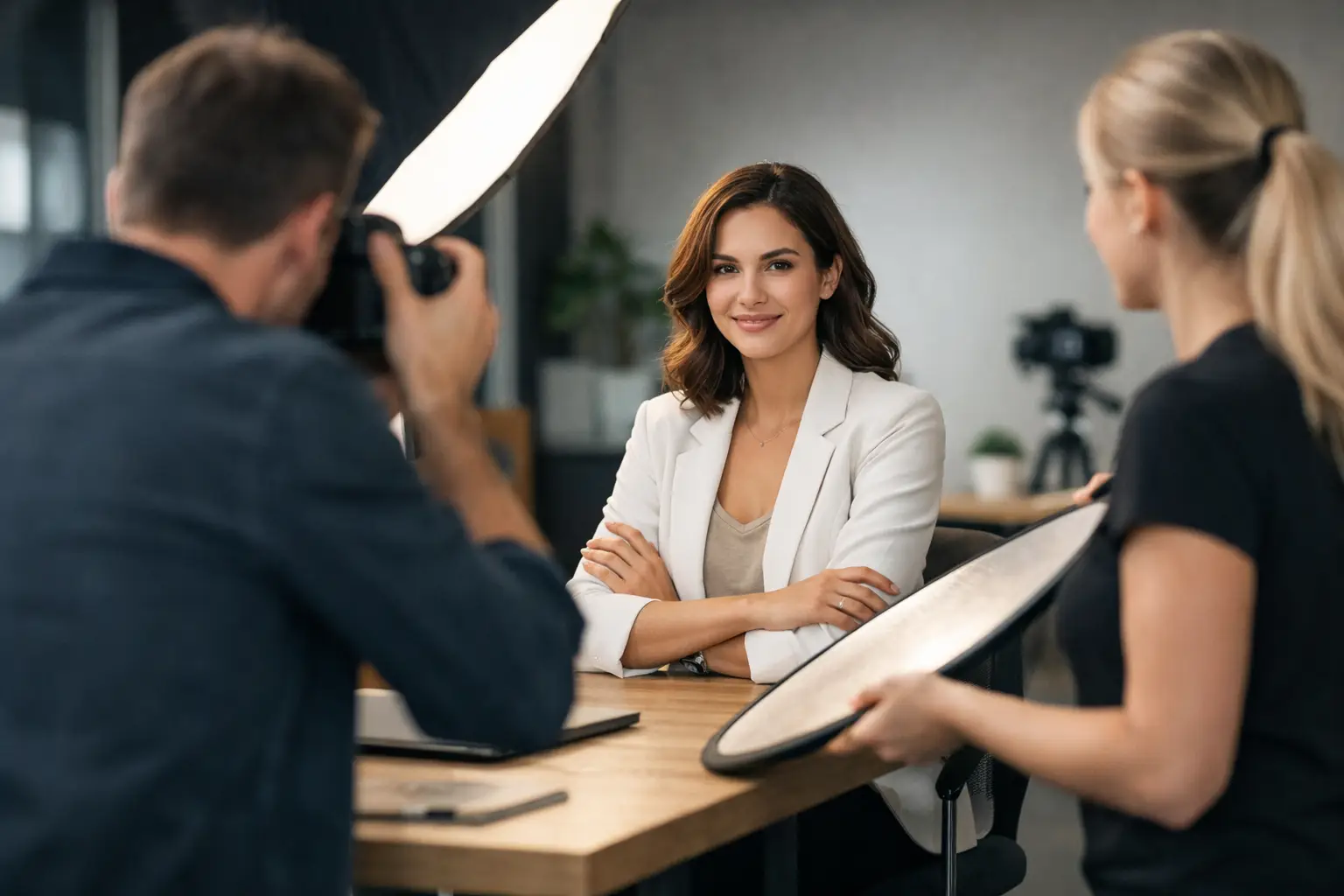
During the session, the photographer’s direction matters as much as the equipment. Small adjustments to posture, shoulder angle, hand placement, and eyeline create a major difference. A collaborative approach helps participants relax, while brief feedback and a well-managed pace keep the day moving. The most credible portraits rarely feel stiff because the person understands what is being asked and has room to settle into the process.
Make the Location Work Harder
Your workplace can be one of the most valuable assets in a commercial portrait session. It shows clients how your team operates, provides visual proof of your environment, and makes the imagery more proprietary. But an office, warehouse, clinic, restaurant, or job site should be prepared with the same care as a studio set.
Walk the location before the shoot. Identify areas with appealing depth, natural light, clean lines, recognizable brand details, and enough space for equipment. Then identify potential problems: cluttered surfaces, exposed confidential information, inconsistent overhead lighting, parked vehicles, reflective glass, or distracting signage.
Preparation does not mean making a real workplace look artificial. It means removing what does not contribute to the frame. A clean, active environment can strengthen authenticity. A staged environment with no connection to the actual business can weaken it.
For industrial or operational settings, safety and access must be part of the production plan. Determine required personal protective equipment, site escorts, restricted areas, timing around active work, and any approvals needed before photography begins. These details are not administrative extras. They protect the people on site and help the visual production remain efficient.
Plan for Consistency Across Time
Businesses grow, teams change, and new hires need portraits long after the initial session is complete. A strong commercial portrait program anticipates that reality. Document the lighting approach, backdrop, camera angle, crop style, and editing standards so future sessions can match the original work.
This matters most for organizations with public-facing teams, multiple offices, or frequent hiring. Inconsistent portraits can make a website feel assembled over time rather than intentionally designed. A repeatable visual system keeps the brand cohesive while leaving room for individual personality.
Consistency does not require every image to look identical. It means viewers should recognize the same standard of care, color treatment, and overall point of view across the collection. For a brand with a more editorial style, that may allow more variation in location and pose. For a corporate directory, it may require tighter control.
Protect Time for Selection and Finishing
The session is only one stage of the work. Image selection and retouching determine whether the final library is useful, credible, and aligned with the creative direction. Establish who will review the proofs, how decisions will be made, and which stakeholders need approval before the project begins.
Retouching should look refined, not obvious. The goal is to remove temporary distractions and present people with care while preserving character, texture, and authenticity. Over-retouching can make a portrait feel generic. Under-retouching can leave avoidable distractions that reduce the image’s professional impact.
Request final files in formats and crops that suit your planned uses. High-resolution files are valuable for print, while web-ready exports support fast deployment. If a campaign needs banner formats, social crops, or space for typography, make those requirements part of the production conversation rather than a last-minute request.
A well-planned portrait session gives your business more than a set of polished faces. It gives your brand a credible human presence – one that helps clients recognize the people, standards, and point of view behind the work. When collaboration leads the process, each frame can carry both visual distinction and a clear commercial purpose.